

ROC curve
ROC-curve (receiver operating characteristics)
ACOMED statistics is a statistics service provider with a focus on the design and analysis of diagnostic studies. In addition, we support companies in the pharmaceutical industry, medical device industry
and CROs in statistical design and analysis of clinical trials as well as in SAS programming. We also offer statistical consulting
and advanced training in statistics.
On this page you will find some hints on ROC curves, their calculation, their application and their interpretation. If you need support in the design and analysis of your diagnostic study, please do not hesitate to contact us (Tel.: +49 (0) 341 3910195).

ROC curves (receiver operating characteristics) provide an overview of the diagnostic accuracy of a diagnostic test. For different cut-off values - usually every measuring point is used - the correct-positive rate is compared with the false-positive rate. The true positive fraction (TPF) corresponds to the sensitivity, the false-positive fraction (FPF) corresponds to the difference 1-specificity (note the reverse scaling of the x-axis, if the specificity is given).
A test is not diagnostic if TPF = RPF. This is the diagonal from the bottom left to the top right (gray line in Fig.).
The figure shows the ROC curve with its confidence band. Selected cut-off values are also given.
ROC curves are a tool for the selection of cut-off values, for more information, see here.
The diagnostic test is able to dicriminate if the curve differs significantly from the diagonal (bottom left - top right). In the ideal case (100% selectivity), the curve lies on the left or upper boundary side of the surrounding square.
A measure of the accuracy of the test is the area under the ROC curve (AUC: Area Under Curve). The area can take values between 0.5 and 1, a higher value indicating the better quality. The easiest way to calculate AUC is with the trapezoidal method, which generally estimates the area well.


The area under the curve AUC is an overview measure and characterized not
the diagnostic accuracy in the regulatory or clinical sense. In the clinical context, a test is used for a specific false-negative rate or a specific false-positive rate (or ranges), ie one considers whether one accepts rather false-positive or rather false-negative. The correct specification of the diagnostic accuracy is therefore a pair of values {Sens; Spec}, alternatively the prediction values {PPV; NPV} or (rarely) the diagnostic likelihood ratios {DLR , DLR-} possible.
The following figure clearly shows that the area cannot be used to specify the diagnostic accuracy:

In the example opposite that refers to 3 tumor markers in bronchial carcinoma (data from Keller T et al. (1998): Tumor markers in the diagnosis of bronchial carcinoma: new options using fuzzy logic based tumor marker profiles. J Cancer Res Clin Oncol 124: 565-574), the AUC for Cyfra 21-1 is statistically significant larger than the AUC for the other two markers.
In the clinically relevant area (high specificities), the sensitivities of Cyfra 21-1 and CEA hardly differ. The AUC is therefore not helpful in reliably assessing the diagnostic quality in clinical use.
Further information on ROC curves
The area under the ROC curves follow the same statistics as nonparametric, comparative rank tests (Wilcoxon statistics). The significance of an AUC compared to the diagonal is therefore easy to calculate with the usual tests (Mann-Whitney's U test). The AUC (see ROC Tool 1) can also be estimated directly from these statistics: AUC = U / (N1 * N2), U test size of the Wilcoxon statistics, N1 and N2 - group sizes).
Therefore, ROC curves are not only suitable for quantitative characteristics, but also for qualitative characteristics that can be classified (ordinal scale), such as B. Findings of X-rays, scores etc.
Comparing ROC curves (test for difference from AUC, see ROC tool 2) are complex. The first step is whether the ROC curves were collected on the same patient or not (connected vs. unconnected samples). With overlapping ROC curves, it makes sense to use z. B. to compare only in a selected specificity range.
One way out is to use 2x2 contingency tables for either the same specificities (then: comparison of the sensitivities) or sensitivities (then: comparison of specificities). The discordant counts can then be compared using the McNemar test (paired sample, several tests are examined in one study; this is the rule for such evaluations) or the Chi2 test (unpaired sample).

The slope of the straight line connecting the lower left zero point with a point on the ROC curve (blue) gives the DLR . The slope of the straight line connecting the point to the top right corner (green) is the DLR-.
You can in acquire Excel tools for ROC curves (see figures below: left: one ROC curve, right: comparison of 2 ROC curves of connected data, executable under Excel 2000 and later versions, Windows environment). Costs: 20 € per tool.
Please order by sending us an E-Mail (info@acomed-statistik.de).
You can also use the software programs
Analysis-It, Medcalc, SPSS, SAS (there as part of PROC LOGISTIC), GraphPad Prism and others to create ROC curves.
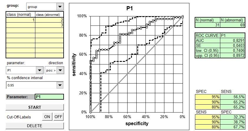
Excel tool ROC curve (display ROC curve, calculation of the AUC incl. confidence interval, estimation of sensitivities for given specificities, estimation of specificities for given sensitivities. Entering the variables in long format (1 column for measured values, 1 column for disease group).

Excel tool 2 ROC curve (display of ROC curves, calculation of the AUC and its difference, each including the confidence interval, p-value for comparison. Entering the variables in long format (1 column for measured values, 1 column for disease group).